Tuesday, May 14, 2013

Linocut away from the riverbend (Linocut- Texture)

Dail, mwsogl a rhaeadr fach gudd
Ann Lewis
Medium: Linocut, 4 colour
16x28cm
http://www.annlewis.co.uk/g1/dail_mwsogl.htm

Ann Lewis is an artist who likes to work in mostly linocut. She is an artist from the UK and resides in Ogwen Valley, in Gerlan. She does many illustrations for children's books, book covers, editorial illustrations, advertising campaigns and graphic works. She also runs a life drawing group for the Royal Cambrian Academy. 
I chose this piece because one, I cannot pronounce the name, and two, because it has such a good use of perspective and texture. The texture in this piece is most obvious in the foreground, on the mossy rock with the leaves scattered across it. It appears soft and welcoming, like someone could sweep their hand on it, and they would feel grassy, plush moss. As the rocks travel up the paper, and into the background, they still keep the soft texture, but where there are thick dark shadows, it appears to have a completely different texture, one that is dark and hard, smooth but cold. The trees have the texture of mixed bark, where you would feel the free as very sturdy, and your hand would fall into the crevice where the bark has eroded away. It's awesome and wonderful and just very lovely. Yeah man. Nature is boss. 


Linocut away my heart: the sequel (Linocut-Shape)

Deep Sea Diver 
Nick Morley
Medium: Linocut
76x45cm
http://vimeo.com/56255143#
http://linocutboy.com/prints/
Aaaah, I'm sorry, I just did something on Nick Morley but I really love this work, so bear with me. Nick Morley is an illustrator from the UK. He has been featured in several magazines, book covers, and on the BBC, a British television channel. He teachers linocut workshops and runs a blog. Wow a linocut workshop, I would wanna do that! 
Anways, the reason I chose this piece is because I love the ocean, first and foremost. I am also a fan of anything that might include cool colours in the palette. Here is a very good use of shape in the linocut. The shape of the diver, and then all the details within his suit are very nice and detailed. There is also the matter of the diver's surrounding background. All small pieces of sea life and a rocky sea floor made out of different shapes. By using heavy shading and shadows in sections of the diver and then the coral on the floor, it adds weight to the appearance of the piece. There is also the matter of the tubes connecting to the diver's suit, which balance out the other shapes, also giving a sense of where a light could be. If you will look to the upper left corner, there is not as much shadow as there is on the bottom right corner. Shape is such a defining tool that can add so much more to a piece, I love it to bits. 


Linocut away the rest (Linocut- Balance)


Beards of the World
Artist: Nick Morley
Medium: lino cut and screen print
 56x56 cm

Nick Morley is an illustrator from the UK. He has been featured in several magazines, book covers, and on BBC, a british televeision channel. He also teaches linocuts workshops and runs a blog.

I chose this piece because it really brings it all into balance. It’s a symmetrical balance brought together by very straight lines and several boxes placed together to make one large box. There is colour, from the screenprinting process used in this piece. There are individual and non symmetrical shapes within the box, the portraits, but it doesn't distract from the symmetry of the piece because they are all of the same subject, men with beards. I also chose this piece because of what I just mentioned, beards. It's so interesting to see the personalities showing through, through the process of hair trimming. 

Monday, February 4, 2013

Intaglio! (Line)

Bless you.

Horrible joke aside, today's printmaking topic is intaglio. Which is an etching done on a copper plate, then ink is pressed into the grooves. After that, it is pressed onto paper to see the image. Cool stuff huh?

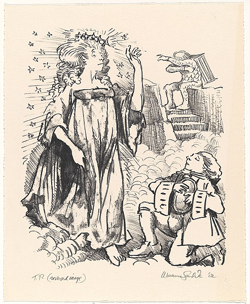
Yeah did you know that Maurice Sendak did that stuff? The man who created Where The Wild Things Are, and Little Bear.
Pretty awesome, don't you think? Maurice Sendak did some for his book, Where the Wild Things Are.


As you can see, his line weight varies in each piece to depict the mood and setting. It's simply fascinating. 


Emboss on my soul (Emboss Shape/Line) post 1

And I shall sleep no more.

Okay! new blog, same user, you poor souls who happen to come across this blog, I am really sorry, this is all only for school. Only that.

ANYWAYS!

Today's subject is blind embossing. What's blind embossing. Think of it like making a stamp, but using a steam roller to make it, and there's no ink. Usually its on paper, you might see it as a seal on a letter from some company and such.

Now the Crane Company its an embossing company, specializing in stationary.

Now ain't that pretty? damn son, fancy stuff there. As you can see, blind embossings can be hard to see without the right light. The company isn't limited to just blind embossing, but blind embossing is more...how you say, gentle in its statement. 

http://www.crane.com/